“Conceptualizing the Aurora Zoom Momentum's UX for innovation, affordability, and reliability.”
The Momentum model is designed for families and individuals with active, on-the-go lifestyles who value the versatility and efficiency of electric vehicles (EVs). As a mid-level offering, this vehicle strikes a balance between practicality and advanced features, catering to users seeking functionality alongside an enhanced driving experience. I developed the UI for key vehicle systems, including driving controls, HVAC, media & entertainment, navigation, and performance displays. The design ensures a clean, cohesive interface that enhances usability and keeps drivers focused on the road.
Year
2023
Duration
4 weeks
Client
Personal Project
Role
UX/UI Designer
Disciplines
UI Design
Branding
Information Architecture
Design System
Despite the growth of the electric vehicle market, there’s a gap in offerings that combine affordability, reliability, and innovative design for everyday Americans. The Aurora Zoom Momentum addresses this by offering a versatile SUV that blends practicality, style, and advanced features, aimed at hardworking, adventurous individuals and families.
The design solution minimizes interface clutter and visual noise, creating a safe and user-friendly driving environment. Key features are positioned for easy access, with simplicity at the forefront to ensure smooth interactions and enhance overall user engagement and convenience.
Benchmarking Competitors
To better understand the key features of an EV SUV, I conducted benchmarking on various models. This helped me analyze the layout of longer rectangular interfaces, identify which features to prioritize and stay informed about current design trends.
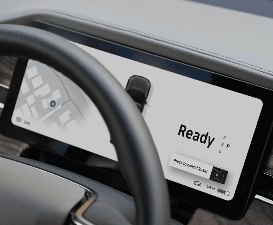
R1S Rivian
Simple and minimal design in the cluster. Amount of information leads to reduced cognitive load
Important information is big and clear for safety purposes
Limited use of color so that signals and warning signs take precedent
Icons in the corner of the cluster may be too small or blocked by the steering wheel. These are important information that may compromise the driver’s safety
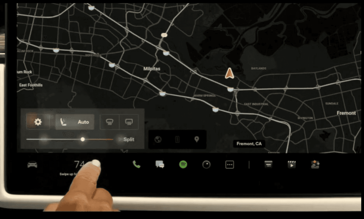
Tesla Model X 2021
Bottom navigation bar is convenient positioned for the driver to reach
HVAC system is easy to access and user-friendly
Innovative HVAC system; easy to control as buttons are placed on its corresponding position in the car
Split screen available; good use of space and provides front seat passenger some control
Entertainment apps seem to be more prioritized than essential features, which are located in a hamburger menu. This requires more steps to access
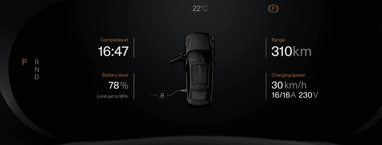
Polestar 2
Good use of car visuals to display states such as charging and opened doors
Accent colors used to enhance brand recognition and reinforce content hierarchy without being overly distracting to the user.
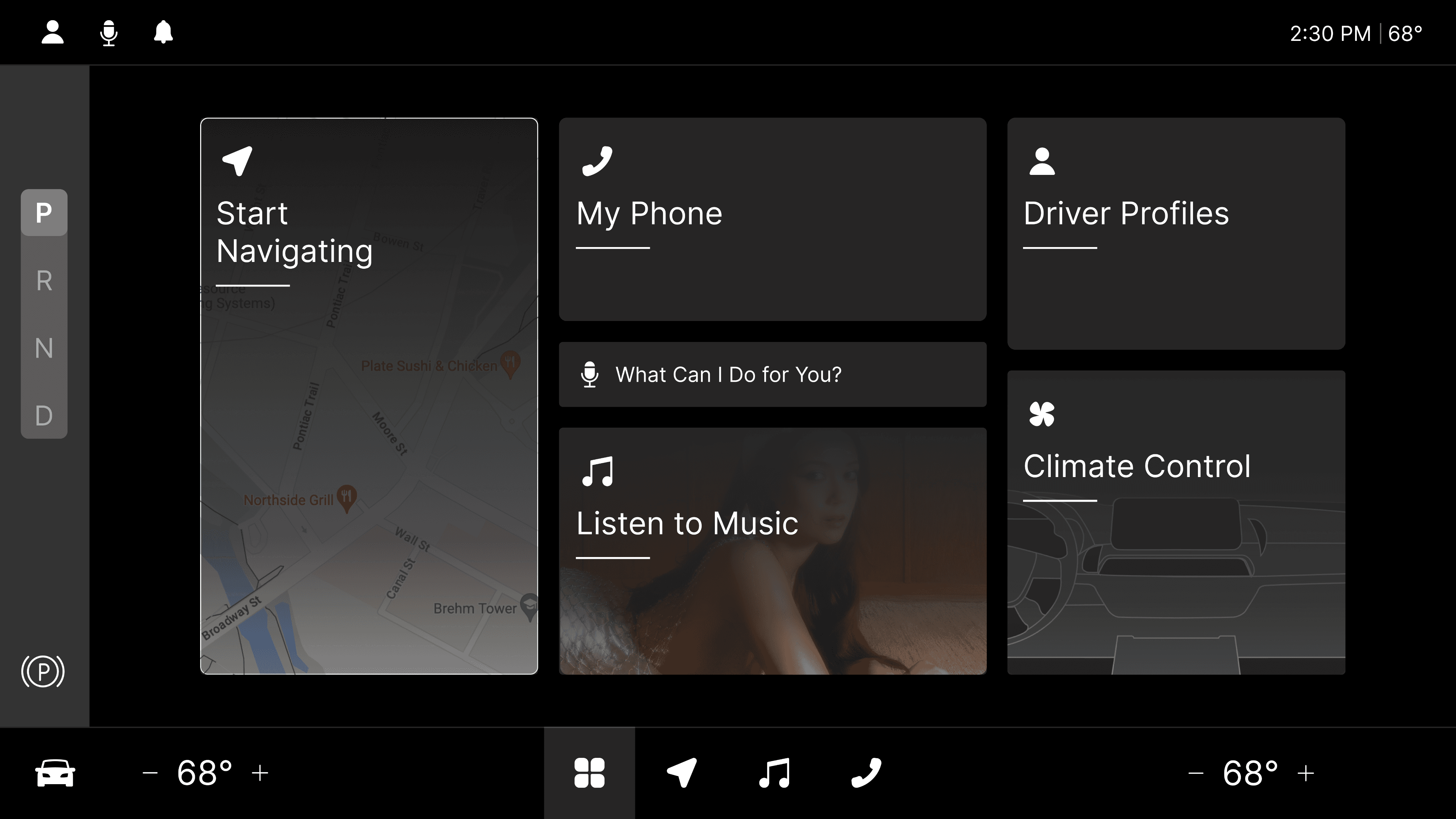
Home screen balances safety features and infotainment. Also provides shortcuts
Big icons for easy access and visibility while driving
Multiple display options in cluster
Navigation tabs can be optimized further to include important features instead of simplifying it into another menu that requires further steps to access
Key Takeaways
Consider adopting Rivian's and Tesla's placement of navigation tabs for easy access, while drawing inspiration from Polestar 2 for its effective use of instrument clusters and display states, both when parked and in motion. Incorporate visual elements of the car to enhance learnability and minimize reliance on text. Additionally, prioritize placing essential features in areas that are most accessible to drivers, such as the lower left-hand corners of the interface.
Responsive Wireframes - Key Features
1
Customizable 'Floating Tiles' Homepage for Multiple Driver Profiles
The customizable 'Floating Tiles' homepage allows multiple driver profiles, providing personalized content that caters to the unique needs of each family member. This feature enhances user engagement and ensures quick, easy access to essential functions for each driver.
2
Simplified and Minimalist Driver Display
The simplified and minimalist driver display focuses on safety by prioritizing key information such as speed, alerts, and battery status. This design reduces cognitive load, improving readability and ensuring that drivers can quickly access crucial data without distraction.
3
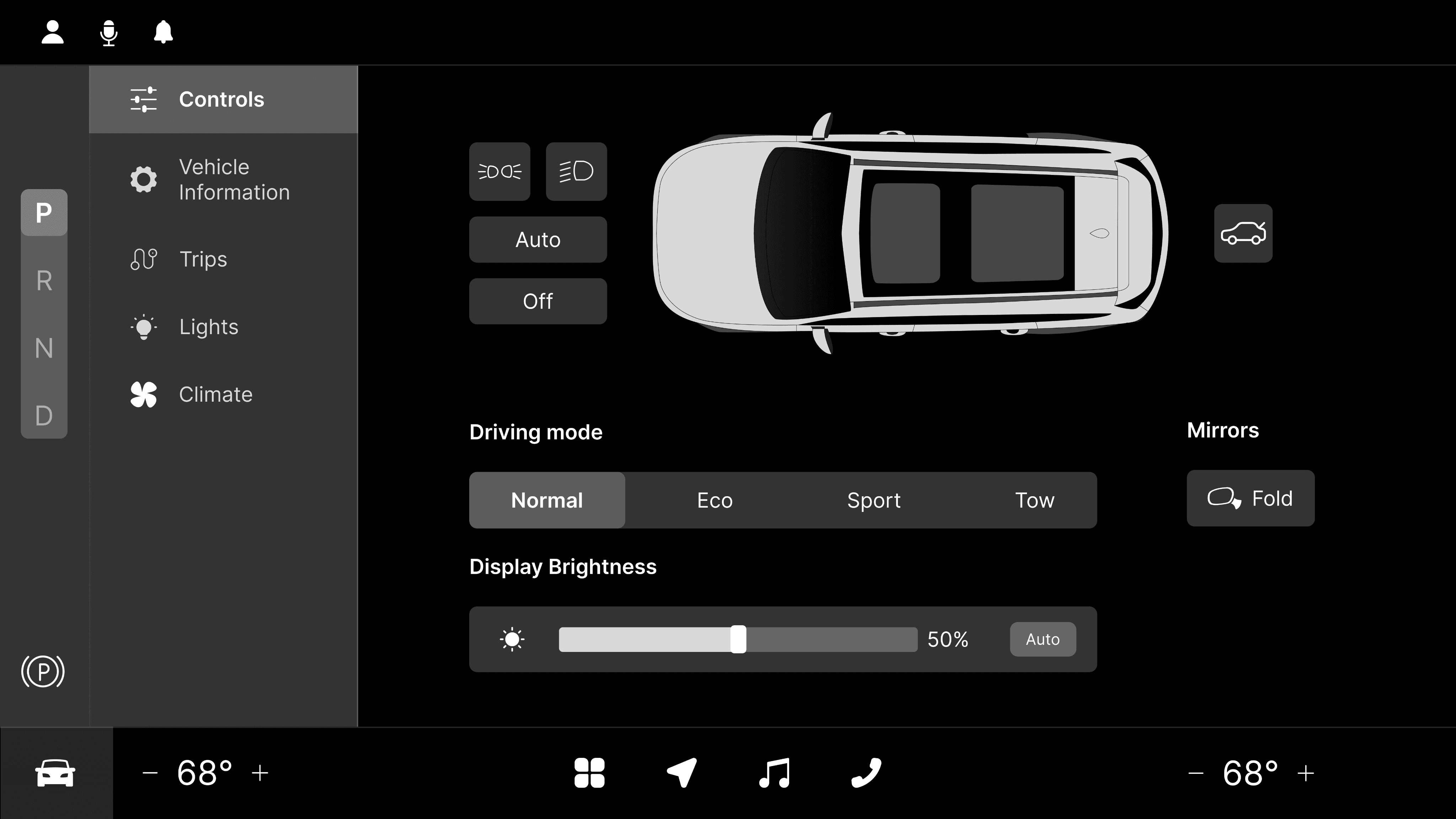
Intuitive Quick Controls with Visual Car Interface
The intuitive Quick Controls feature includes a visual car interface, where controls like trunk opening, light adjustments, and window operations are positioned at their corresponding locations on the vehicle diagram. This design simplifies the process of locating and using various controls, making interactions more intuitive and efficient for the user.
What did I learn from this work?
In this project, I applied several UX laws within the context of automotive UX, gaining insight into how design principles can be adapted for this specific field. I learned how to create interfaces that effectively balance visual appeal with safety, a critical factor in vehicle design. As someone initially unfamiliar with EVs, it was particularly interesting to design for a digital interface that replaces traditional manual settings, such as climate control. I also had to consider how the SUV’s target audience—mainly families—impacts design choices, emphasizing the need for infotainment options and passenger controls.
