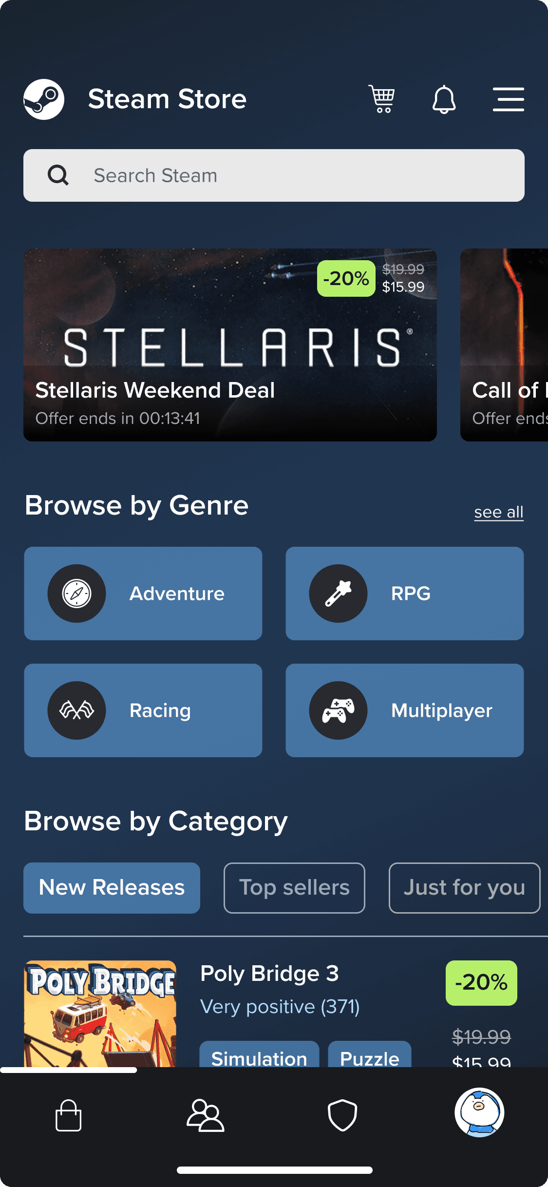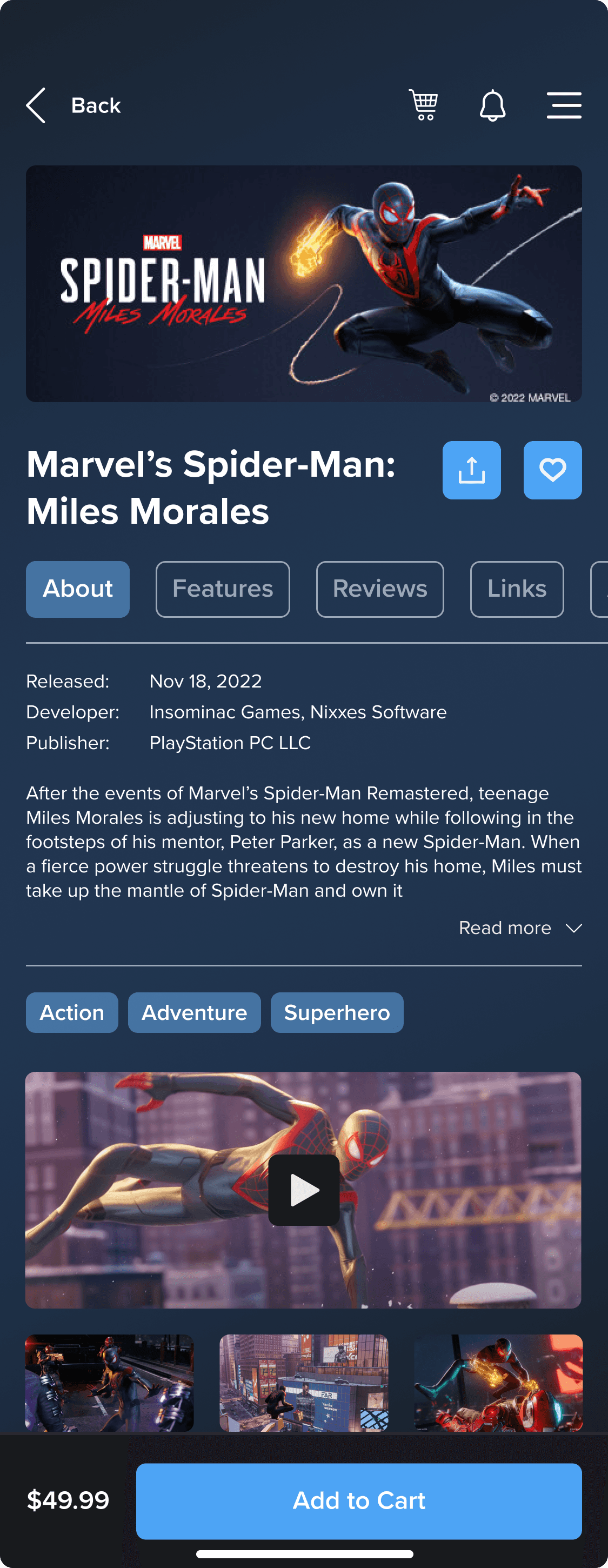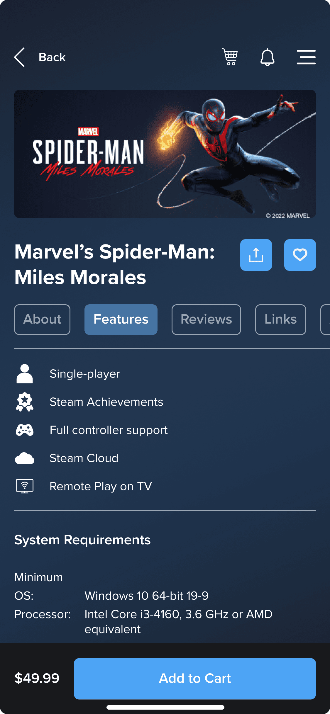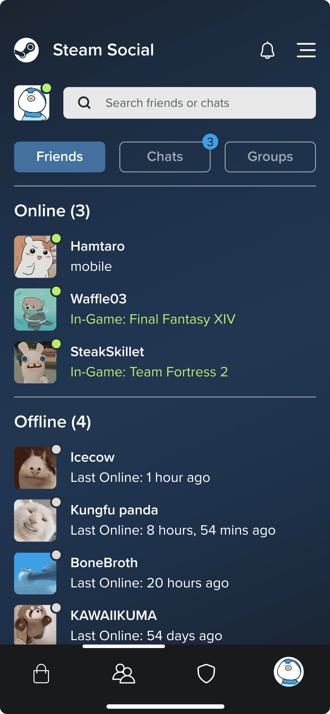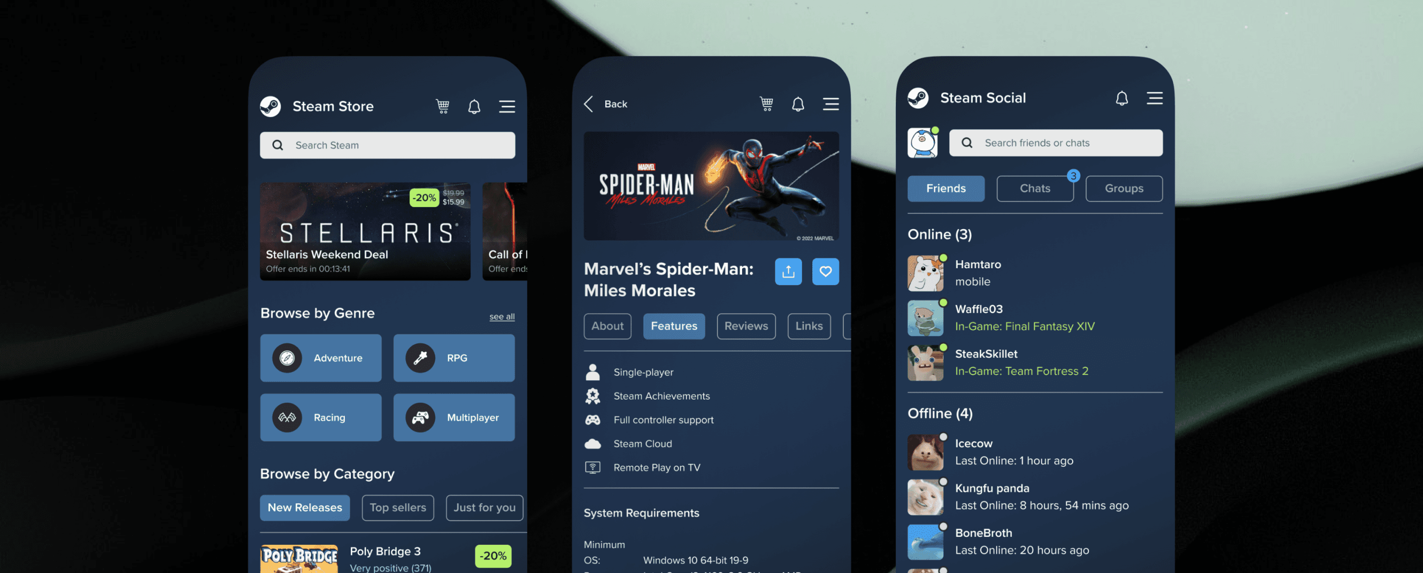
“Enhancing the user experience of the Steam mobile app by improving its interface and functionality”
The Steam app is a popular platform for gamers to buy, download, and play games. The app has some usability issues that could be improved. E.g. the app's navigation is not very intuitive, and it can be difficult to find specific games or features. Additionally, the app's UI is outdated and could use a refresh.
Year
2023
Duration
4 weeks
Client
Personal Project
Role
UX/UI Designer
Disciplines
UI Design
Branding
Information Architecture
Design System
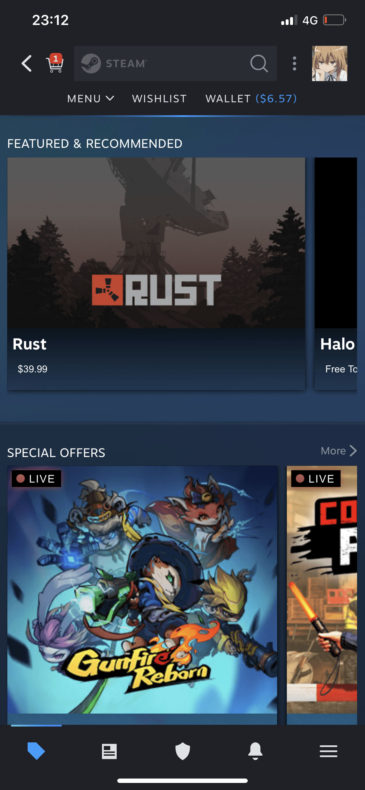
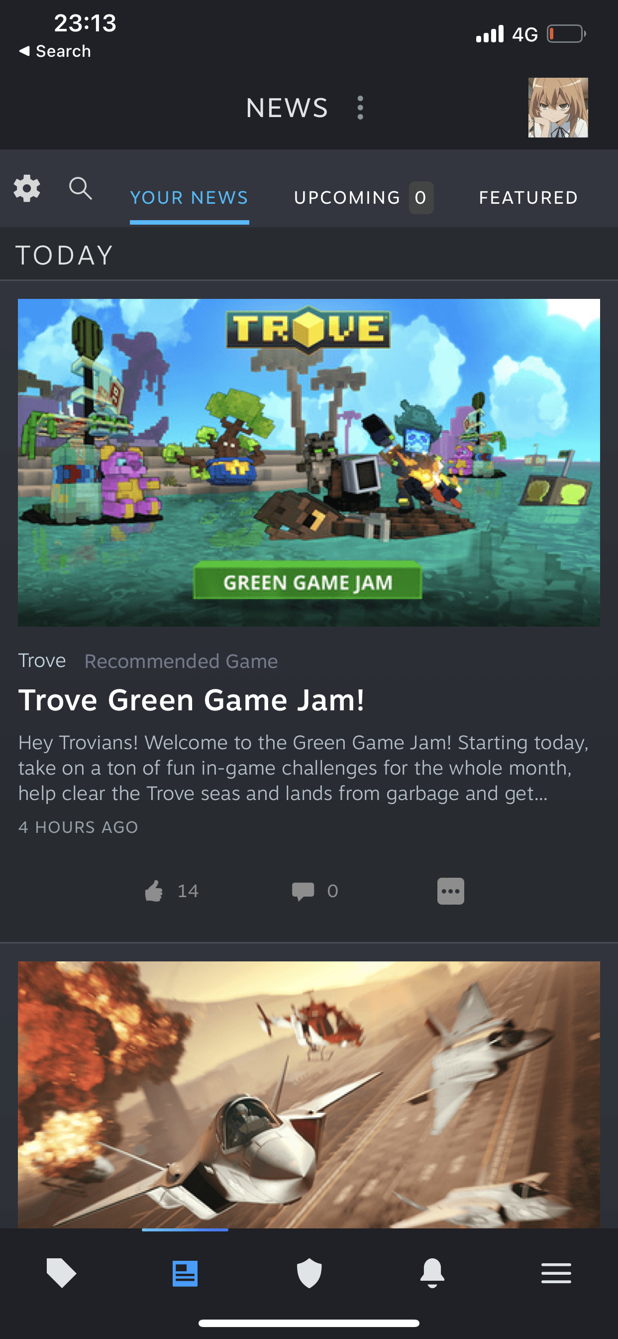
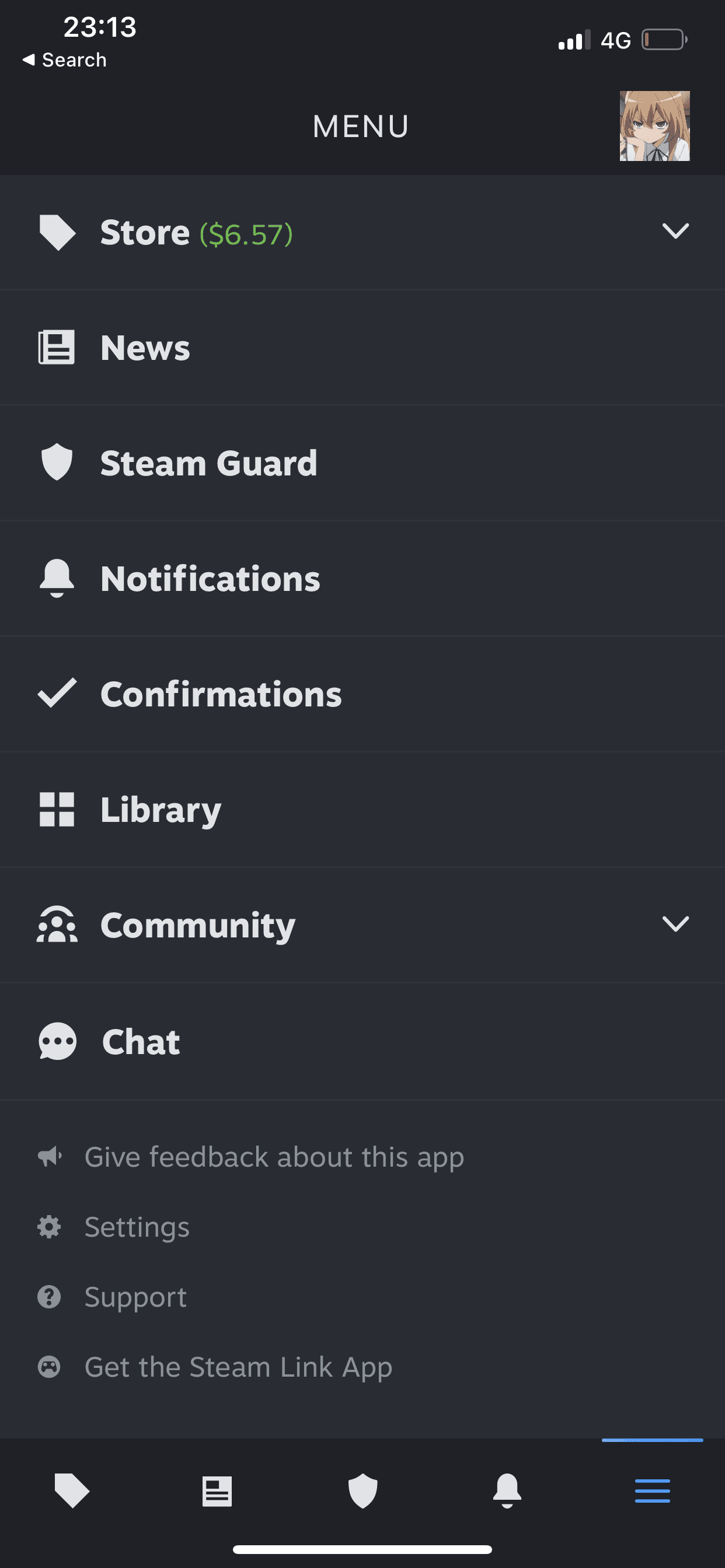
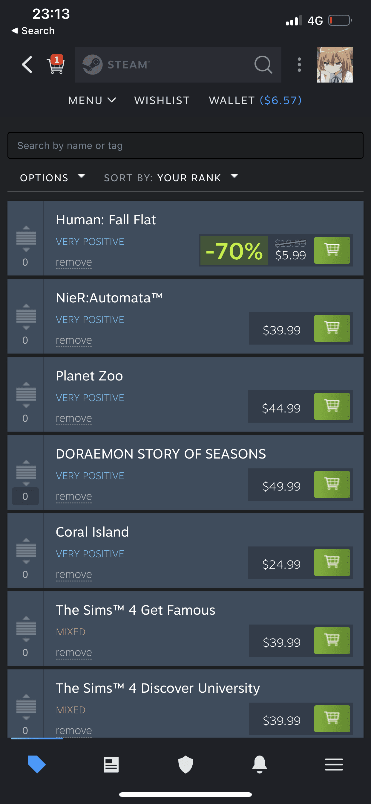
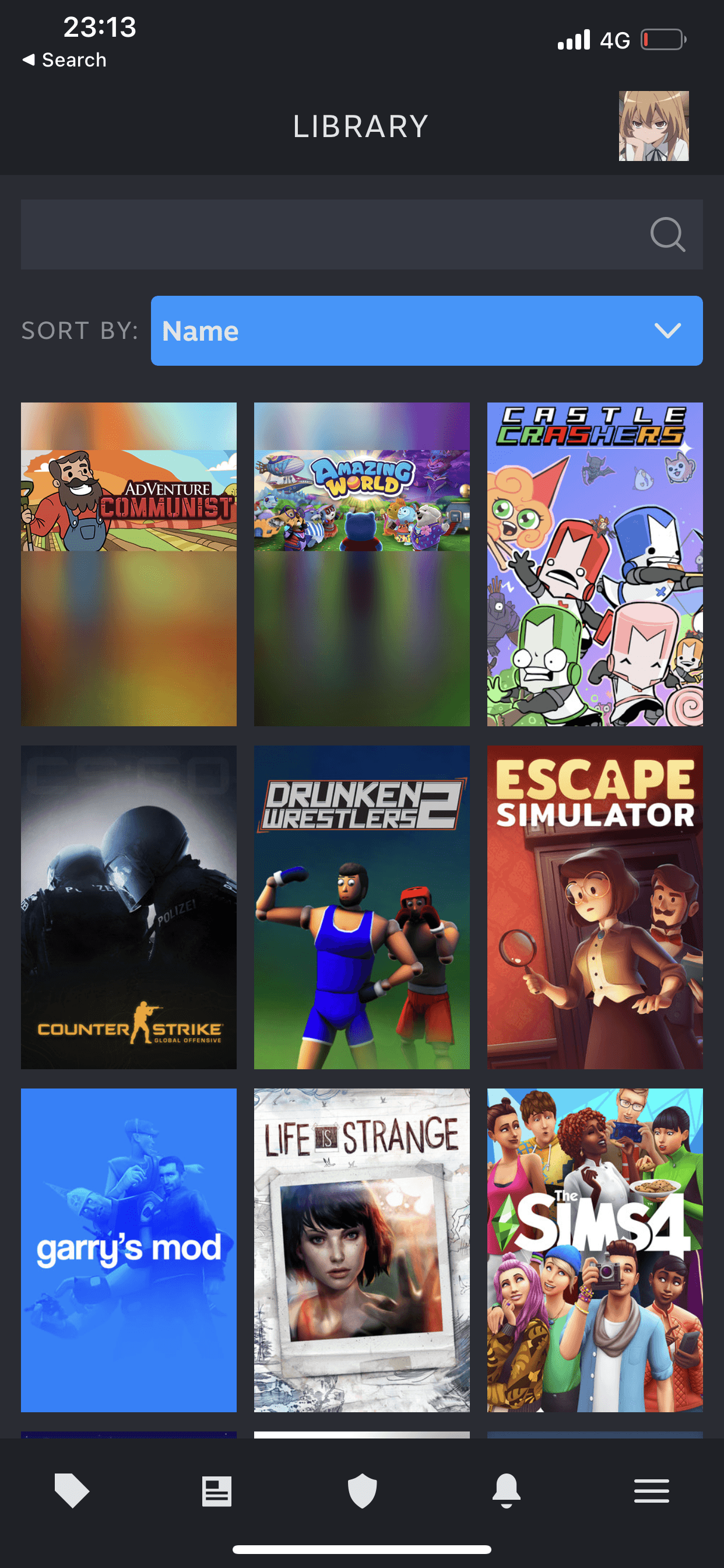
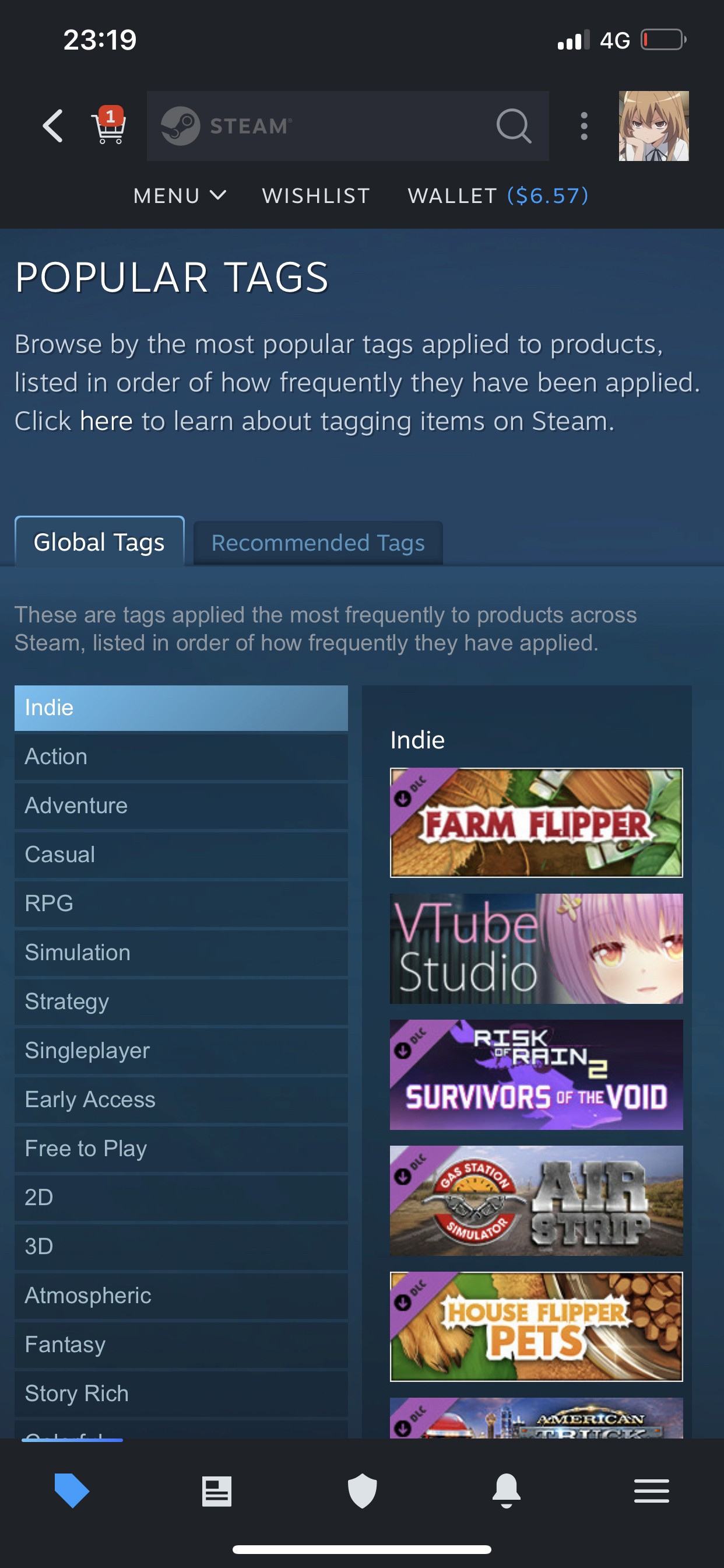
The platform’s complex and cluttered interface makes navigating the game store challenging, while the outdated and inconsistent user interface detracts from the overall experience, hindering the app's learnability. The design system's inconsistency makes it difficult for users to identify primary functions. Additionally, the limited social features, which rely on an external app, further complicate user interaction and reduce community engagement due to the lack of design consistency across platforms.
Revise the content hierarchy to make it easier for users to discover and manage the games they want to play
Promote discoversability for deals and promotions for the games users are interested in
Create a visually appealing and consistent design system while maintaining the brand identity
Objectives
To identify the feature that users primarily use on the Steam mobile app and gain an in-depth understanding of the users’ pain points and how users interact with the app
To identify areas of improvement in the UI of Steam’s mobile app by comparing with competitors.
Method
Primary research
User interviews
Secondary research
Reviews from the app store, discussion sites
Competitive analysis
Market research on demographics
User Interviews
I conducted a brief interview on two participants about their experience using the Steam mobile app. The two users were recruited through convenience.

Participant 1
Age: 20 years
Occupation: College Student
Gaming Experience: Casual
Years on Steam: 5 years

Participant 2
Age: 23 years
Occupation: Data Analyst
Gaming Experience: Casual
Years on Steam: 7 years
Key Finding #1
The mobile app needs to be simplified. Compared to its competitors, users prefer the Battle.net app’s intuitive interface.
Key Finding #2
Users like Steam’s visual branding and would rather not change its aesthetics
Key Finding #3
The app isn’t used often due to the lack of functionality in what is supposed to be its primary features
User Reviews
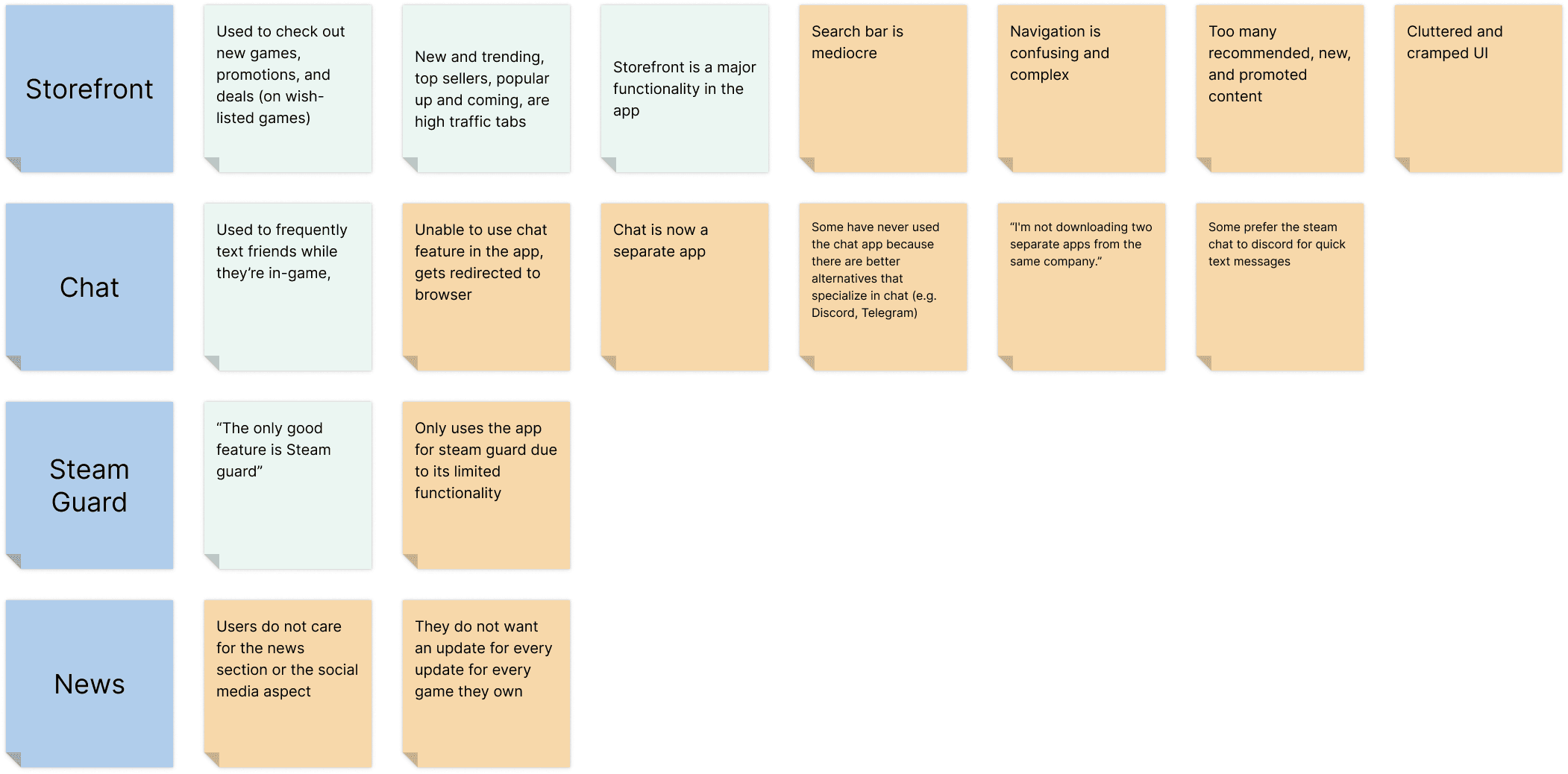
The first step I took in conducting my secondary research was to read and analyze reviews from relevant sites on the internet, including Steam's app store page, Steam discussion forums, and Steam's subreddit on the popular discussion site, Reddit. By exploring these platforms, I aimed to gain valuable insights into user satisfaction, pain points, and feature preferences, enabling me to identify areas of improvement and inform the redesign process effectively. An affinity map was created to better organize my findings (pain points are categorized by the orange sticky notes).
Key Finding #1
Many mobile users use Steam for account authorization purposes (Steam guard). The app isn’t used often due to the lack of functionality in what is supposed to be its primary features
Key Finding #2
The UI of the storefront needs major improvement, including better content hierarchy, intuitive navigation, and a simpler layout
Key Finding #3
The chat feature is commonly used by users for quick messaging, although some users prefer utilizing other messaging apps to communicate with their friends due to the additional features they offer
Key Finding #4
Users do not like that the chat feature is now in a separate application
Competitive Analysis
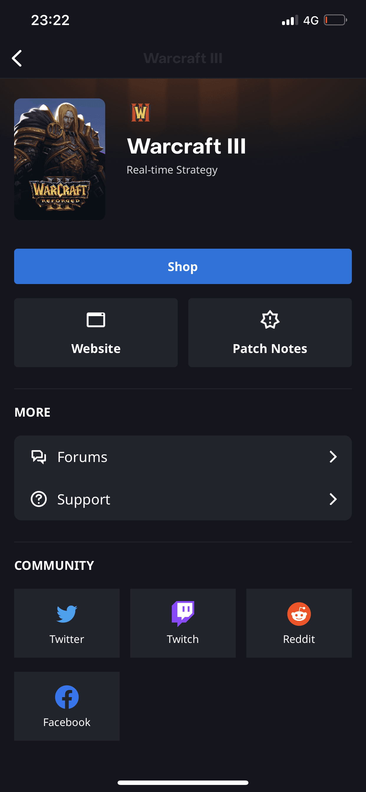
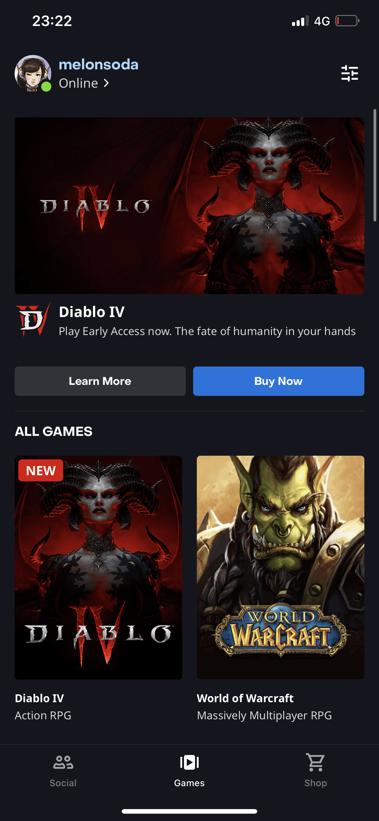
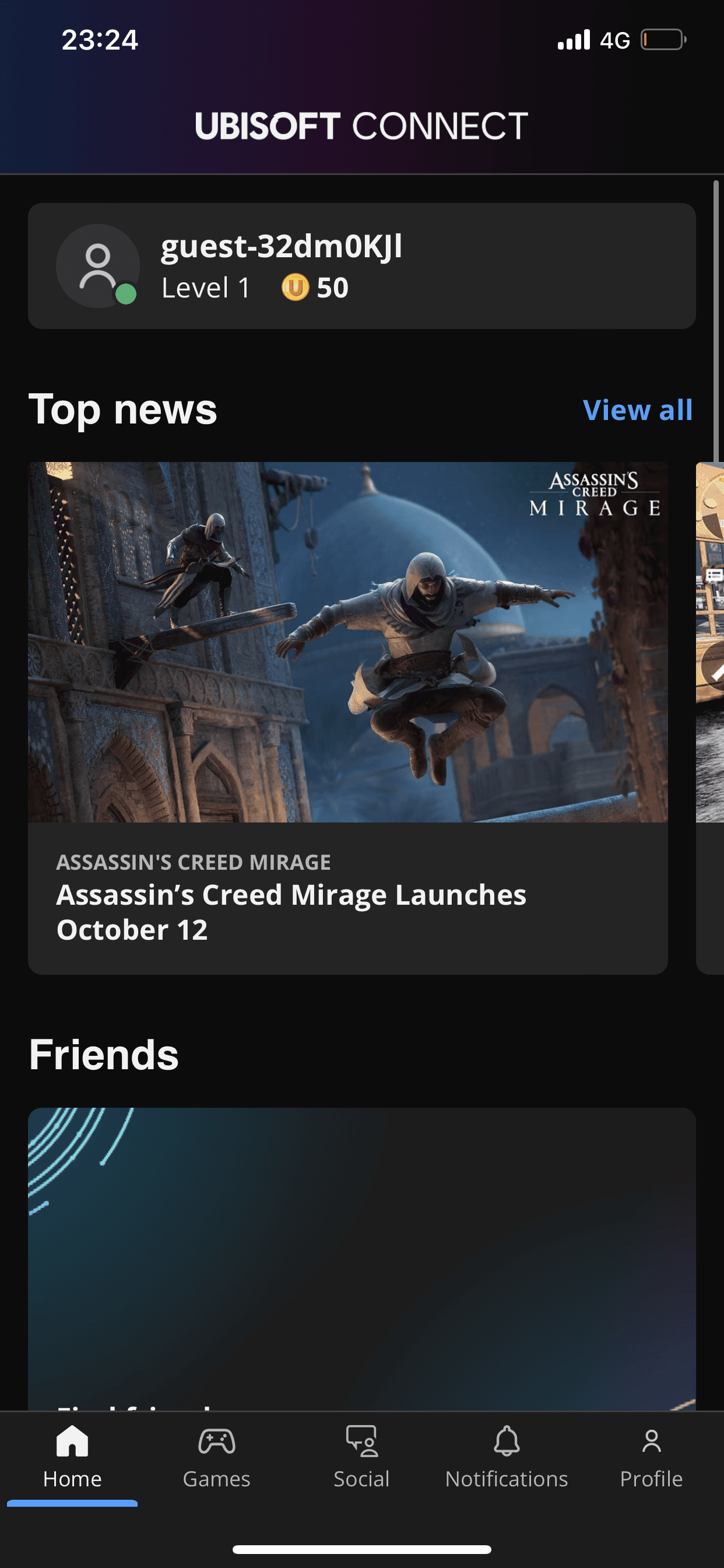
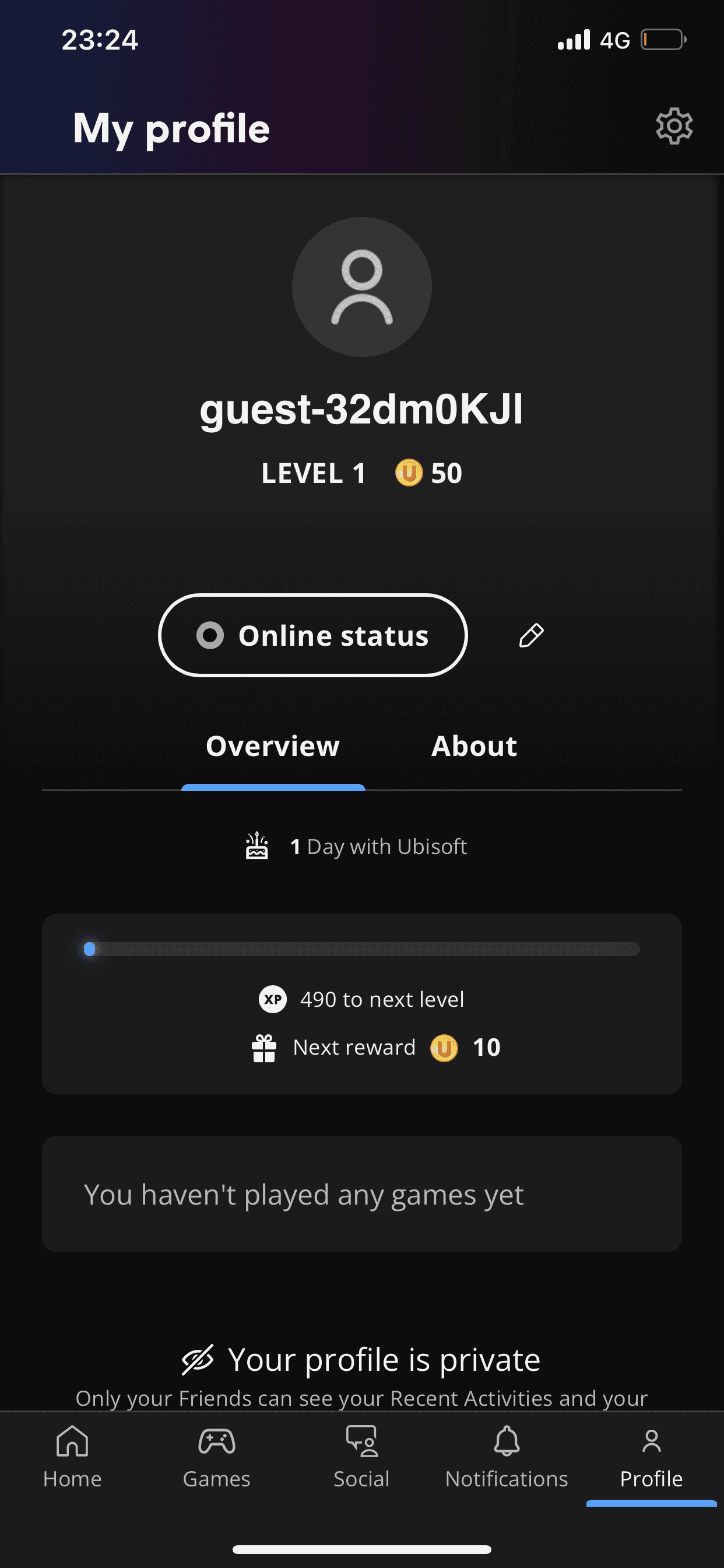
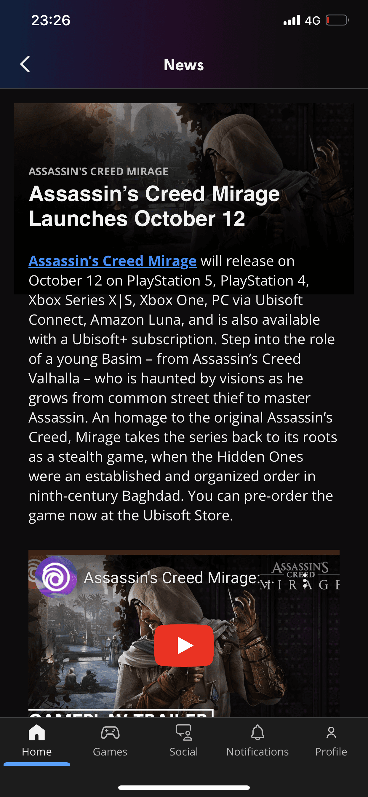
The competitive analysis involved an evaluation of two other similar game distribution platforms: Ubi Connect and Battle.net app. Each app was assessed based on its features, strengths, and weaknesses to gain an in-depth understanding of the competitive landscape, what Steam does well, and what it may be lacking compared to its competitors.
Steam
Largest collection of games
Store, community, news, library, chat, notification feature
Has the ability to wishlist games
Games organized in genres and categories
Too many features packed in a mobile app
inconsistent and unintuitive UI
Odd content hierarchy
Chat feature leads to a different app; forces the users to download a separate app
Battle.net
A simple and consistent UI
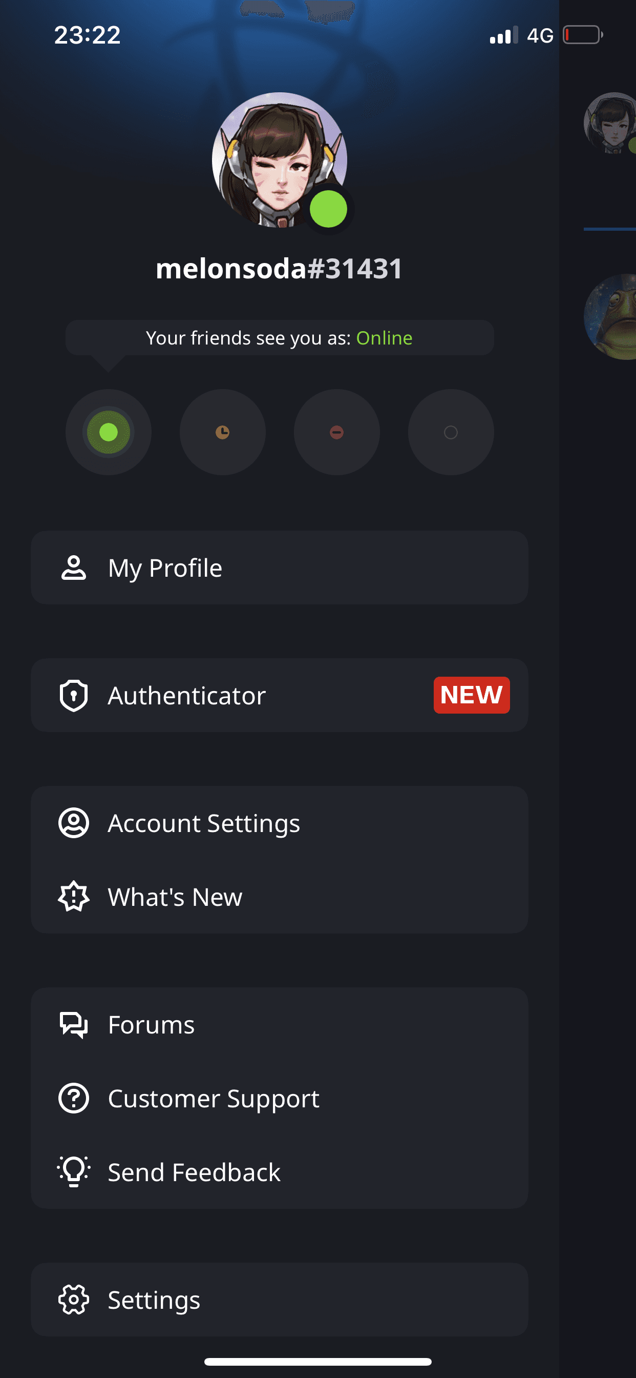
Easy to set status
Straightforward and user-friendly navigation
Has a tab for socials which contains friends, chats, groups
Has a marginally smaller collection of games
Doesn’t provide quick overview of games (ratings, devices, etc)
Ubi Connect
Home (overview), games, social, notifications feature
Has a news feed which provides updates on friends as well as games
Has a sleek and simple UI design
Easy navigation
Cannot purchase games on this app
No storefront
Concluding the Research
Findings show that the two main features that need to be prioritized are the store front and chat page. These features will benefit the app and user retention upon improvement. As of now, the lack in functionality and unintuitive (and outdated) UI hinders users from making use of the app. It is also apparent that users deeply value Steam’s brand identity; Steam’s colors invokes familiarity and loyal users would prefer not to stray too much from its current aesthetics.
What did I learn from this work?
This project was completed as a mini side project alongside my internship, where I aimed to apply the skills I had gained. Specifically, I focused on implementing design systems, utilizing auto layout, and creating Figma components. These techniques not only allowed me to streamline the design process but also helped optimize my workflow, reflecting the growth I achieved during my internship.
What’s next?
Reflecting on this project, I’m satisfied with the UI design outcomes, but I recognize areas for improvement in my process. Instead of identifying the core problem upfront, I focused too heavily on validating the need for a more attractive UI. This led to a solution-first approach during the discovery phase, rather than thoroughly understanding the problem from the beginning. In future projects, I would prioritize problem identification and allow insights from research to guide the design direction.
High Fidelity Wireframes
