challenge
Growing Hope currently lacks a centralized and accessible way to share information about their mission, programs, and amenities, as much of the operational knowledge resides with the farm manager. This results in gaps in staff knowledge regarding the farm’s features and offerings. As a result, visitors and volunteers struggle to gain a comprehensive understanding of the farm’s resources, events, and opportunities. This lack of understanding limits engagement and participation, hindering Growing Hope’s ability to educate the community and involve more people in their mission.
Research Process
analyzing market & competitors

Direct Competitors: Exploring how similar organizations provide educational or self-guided tools related to agriculture or nature spaces

Analogous Competitors: Examples outside of farming.
Validating our assumptions
We set out to uncover navigation pain points and information gaps at Growing Hope’s urban farm, aiming to identify opportunities to streamline information sharing and improve visitor engagement. Our research also focused on evaluating stakeholder priorities to guide the development of a thoughtful information hierarchy that would meet the needs of both visitors and staff.
12
User Interviews
to learn about how they choose to interact with the farm and what information they want to know more about, as well as what information is lacking or unclear
17
Survey Responses
to gather quantitative data on Growing Hope’s target audience and help determine which user group to prioritize in our solution

Our team synthesized insights from interviews, contextual inquiries, and surveys using an affinity diagram in FigJam. By organizing participant quotes and key findings into recurring themes, we identified patterns that informed our UX requirements.
key insights uncovered…
Wayfinding Confusion 🔍
Visitors often struggled to find their way around the farm due to unclear signage and section divisions.
Access Uncertainty 🚷
Many users were unsure which areas were open to the public versus staff-only spaces.
Interactive Engagement 🧑🌾
Users showed strong interest in hands-on experiences, like picking produce and exploring gardens independently.
Desire for Context on Plants and Gardens 🥕
Visitors frequently asked about what crops were growing, how plants were used, and the purpose of different garden spaces.
Personas and Journey Maps


Design Process
Ideation and Sketches
We converted UX requirements into sketch prompts (e.g., “How can we show private vs public areas?”). Each team member sketched ideas individually → dot voting → merged into shared concepts.

Mid-fi Wireframes

Our first mid-fidelity prototype used lines and shapes to distinguish between the areas on the farm. After receiving feedback from our client, we decided to use a mix of whitespace and lines to denote pathways on the farm to inform users of where they are encouraged to walk. We then received feedback from peers that the lines we included to denote pathways instead resembled barriers and would not think that those areas were accessible to visitors.
Mid-fi Wireframes
After Peer Feedback Sessions

After gathering feedback from peer evaluations, we discovered that it was easier to discern each area and gain a clearer understanding of the farm layout with vertically oriented sections. The outlined walkways, background colors, and colorcoded sections were much clearer and provided more context to the organization of the farm.
Iterative User Testing
Goals and questions
We hoped to explore the following questions:
Are the pathways on the map intuitive?
Can users easily locate key areas?
Are users able to understand labels, icons, and legends?
Does the information about the areas within the urban farm cater to all user groups?
Is the overall experience of the map enjoyable for the users?
key insights uncovered…
Users seek more clarification on how to orient themselves on the farm 🚏
Action items: Add starting point, exit points, and additional illustrations
Users are confused about how to interact with the map 🗺
Action Items: Add a sentence above the map, calling users to interact with the map in specific ways, highlighting the available features.
Users would like to see clear indications of common places to visit on the farm ⛲️
Action Items: Create unique illustrations to mark main farm areas.
Users are confused by the wording of the legend 📝
Action Items: Reword labels for clarity and better reflect access levels; expand legend explanations for user understanding.
Final Product
An interactive farm map experience designed to support self-guided tours at Growing Hope’s urban farm.
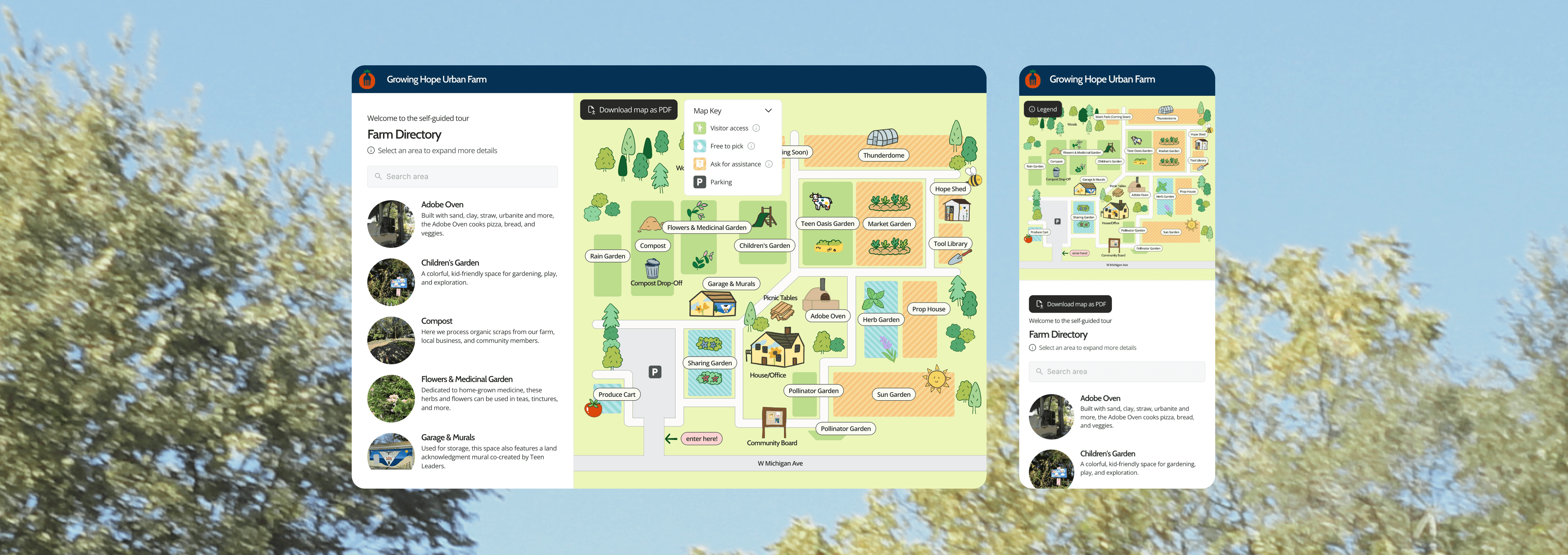
Main Screen


Overlay information
On desktop, users can click on a section in the farm directory and it opens the overlay. The overlay contains crucial information about each section including access level, description, crop information, tool rental, etc. The overlay contains the access level key denoted by color from the legend.
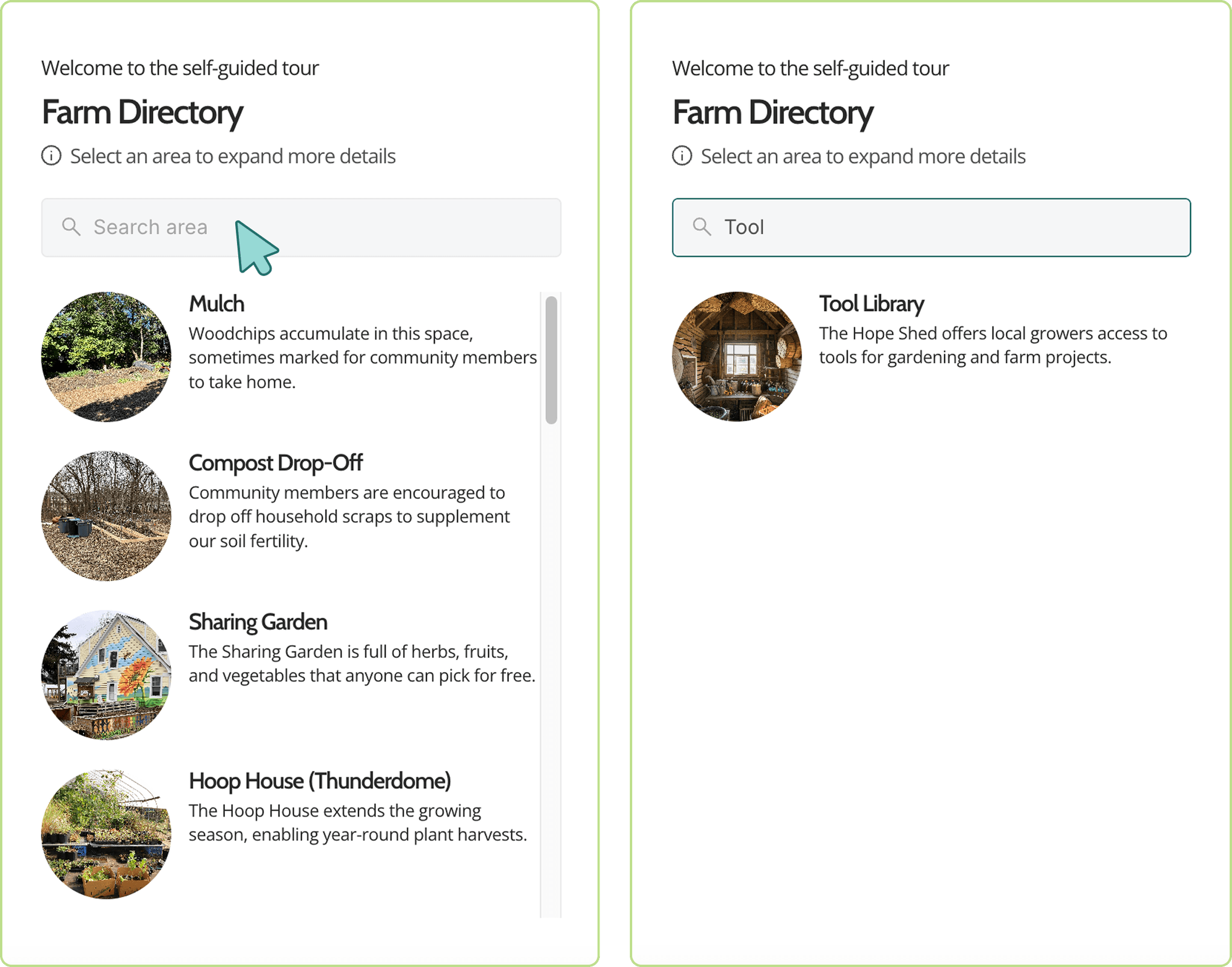
Search and Directory
The search bar is meant to help users find garden sections easier by searching key words from the titles of each section.
The farm areas live in the side bar directory and provide short descriptions and images of each area. This gives users a comprehensive list of the farm areas.

Map Key
The key is collapsable and moveable around the map. The four access levels on the legend are “Visitor access”, “Free to pick”, “Ask for assistance."
When the key is open, the user can hover over each icon and read more detailed information about what each color denotes.

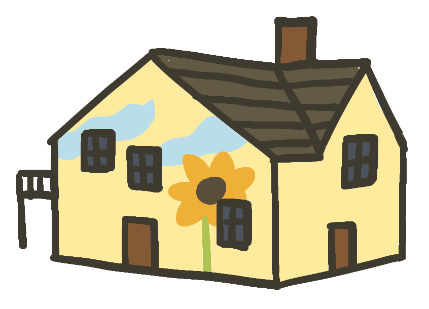

Custom illustrations
Hand-drawn visuals were created to reflect the real layout and identity of the farm, helping users recognize key areas at a glance. These illustrations not only made the map more engaging and approachable, but also supported wayfinding by visually distinguishing different areas and landmarks.


A physical map to pair
To ensure accessibility across all user groups, we designed a printed version of the map to complement the digital experience. The physical map supports visitors without smartphones or those less comfortable with digital tools. Key locations, legends, and entrance points are preserved to maintain consistency between formats, and QR codes on the handout link directly to the digital map for real-time updates.
project outcome
We delivered an interactive digital map prototype built in Framer, designed to integrate seamlessly into Growing Hope’s website. The map allows visitors to explore different areas of the farm on their devices and better understand Growing Hope’s mission, programs, and resources. A printable physical handout was also developed to support accessibility for visitors navigating the space in person.
One of the biggest challenges was designing around the limitations of the client’s content management system (CMS). I learned how to structure the map content to be easily updated by non-technical staff while still maintaining a coherent and user-friendly experience.
The self-guided experience empowers Ypsilanti community members to engage with Growing Hope independently, furthers the organization’s educational goals, and encourages deeper involvement with sustainable community initiatives.