challenge
The Steam mobile app's inconsistent user interface creates a disjointed experience, with unclear visual hierarchy and navigation issues, as well as limited social features. The lack of cohesive design elements and uniformity across features detracts from usability and user satisfaction.
Before
Research Process
analyzing market & competitors
Competitive benchmarking involved evaluating two similar game distribution platforms: Ubi Connect and Battle.net.
validating my assumptions
Two interviews were conducted with two participants from within my network.

Participant 1, College Student
Gaming Experience: Casual
Age: 20 years
Years on Steam: 5 years

Participant 2, First Jobber
Gaming Experience: Casual
Age: 23 years
Years on Steam: 7 years
The biggest theme was the need for simplification. Users consistently expressed frustration with the Steam mobile app’s cluttered interface and lack of intuitive navigation. While they remained loyal to the branding, the poor visual aesthetics led to the abandonment of the app.
investigating user reviews
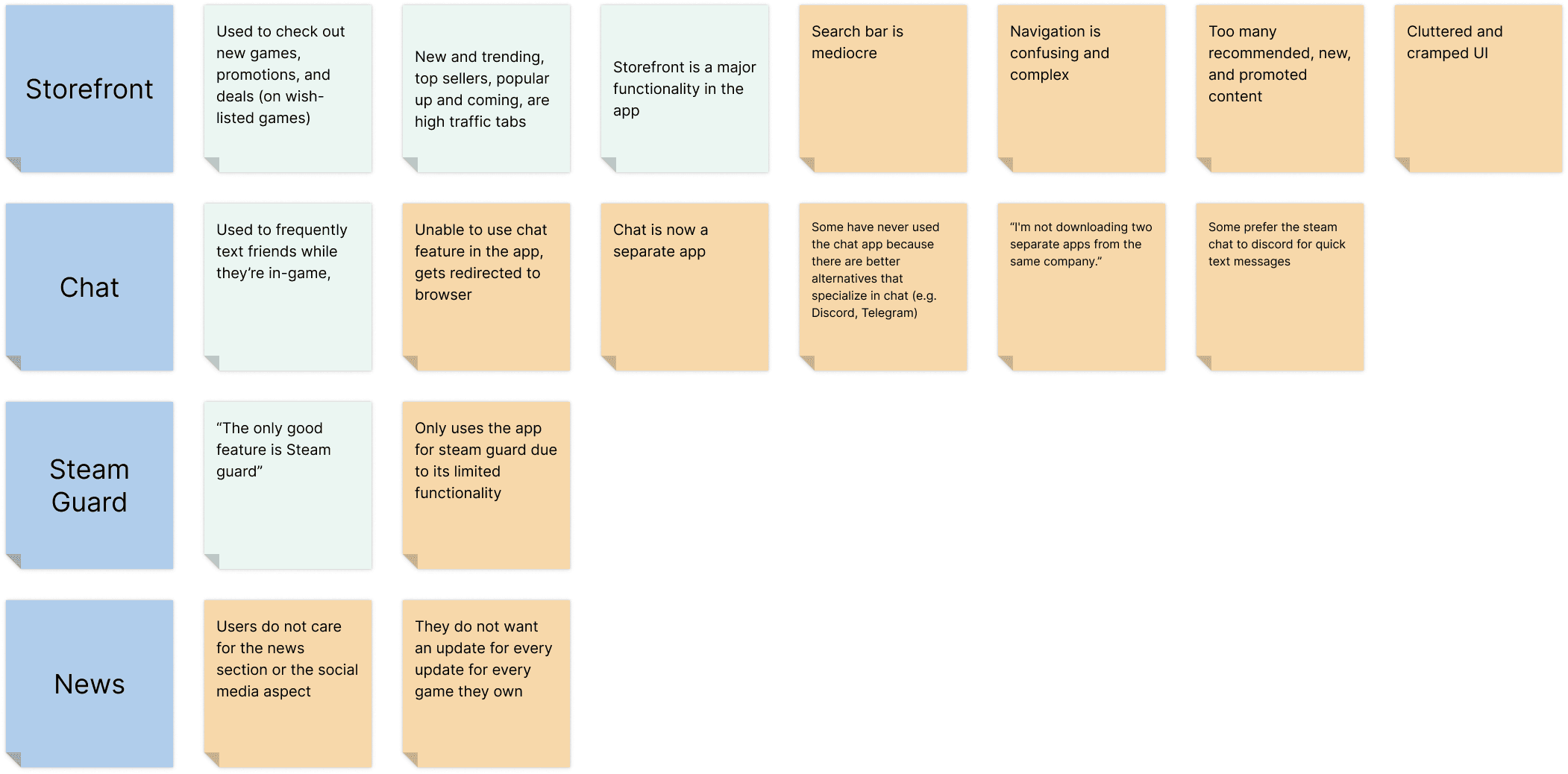
I began my secondary research by analyzing reviews from Steam’s app store page, discussion forums, and subreddit to identify user satisfaction, pain points, and feature preferences. These insights were organized into an affinity map, with pain points categorized using orange sticky notes.
key insights uncovered…
Improved Aesthetics 🎨
The UI of the storefront needs major improvement, including better content hierarchy, intuitive navigation, and a simpler layout
Chat Feature ✉️
The chat feature is commonly used by users for quick messaging, although some users prefer utilizing other messaging apps to communicate with their friends due to the additional features they offer
A Separate Chat App🫥
Users do not like that the chat feature is now in a separate application
Hi-Fi Wireframes
A redesign project that enabled me to practice building a cohesive design system and creating components on Figma.
homepage
Storefront
reintegrated chat feature

Project takeaways
This project, completed as a mini side project alongside my internship, allowed me to apply the skills I had gained, including implementing design systems, utilizing auto layout, and creating Figma components. These techniques streamlined the design process and optimized my workflow, reflecting my growth during the internship. While I’m pleased with the UI design outcomes, I recognize areas for improvement in my process. I focused too heavily on validating the need for a more attractive UI rather than identifying the core problem upfront. This solution-first approach during the discovery phase limited my understanding of the problem. Moving forward, I plan to prioritize problem identification and let insights from research guide my design direction.


